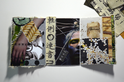
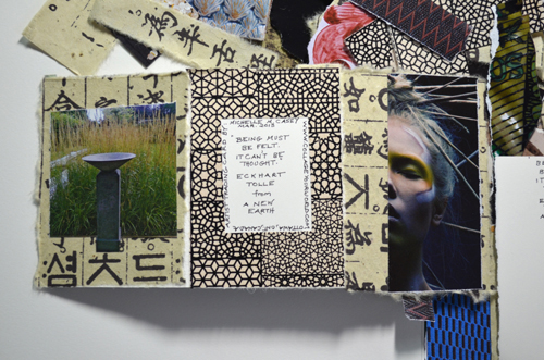
 Michelle Casey, “Being” (Interior, detail), ATC, Collage, 7.5 x 3.5 inches, March 2013 There’ve been so many exciting things happening on the Artist Trading Card (ATC) front here at Collage Your World – I’m delighted to share them with you!
Deeply in Love in February…
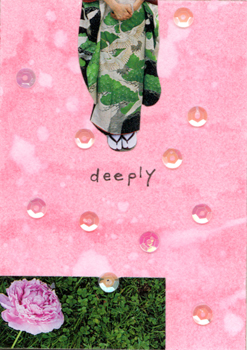
In mid February I participated in an exchange with my Ottawa-based ATC group run by my friend Olive Jones. Being the month of Valentines our theme naturally gravitated towards the subject of love. Always trying to steer my projects in different directions, I thought it would be a great opportunity to try experimenting with my new Tim Holtz Distress Markers. For “Deeply” (above), I used a gorgeous passionate pink marker on my card and then brushed over it with a light wash of water. After letting it dry, I dripped drops of water onto it which I lightly dabbed off with a paper towel to achieve a cool spotted look. Usually my ATCs are replete with imagery but with this one, I wanted to showcase my background effects so I chose a couple of strong images and decided to go with a minimal look; adding only a few translucent sequins which reflected the background’s colour… so stunning and simple! In this case, I really felt less was more!
 Michelle Casey, “Deeply” (for Kevin Casey), ATC, Mixed Media/Collage, 3.5 x 2.5 inches, February 2013 Texture-based ATCs: Playing with Surfaces
At the end of February, I exchanged ATCs with Collage Your World list member, Jeanne-Sylvie-Bellet of France. It’s been such a privilege to become acquainted with her; she even joined me on Facebook! After discovering more about her creative world, I learned we shared much in common. I was delighted when she consented to trade ATCs with me; we agreed to work on the theme of texture. Knowing Jeanne-Sylvie is a great fan of spiritual teacher, Eckhart Tolle author of “A New Earth”, I decided to make her a triptych ATC based on a quote from Tolle’s book: “Being can’t be thought. It must be felt.” I added visual textures and various papers surfaces I felt would work with the quote… even raising an image fragment with thick double-sided tape to give it a 3D tactile feel. I hoped she would like it and she did! Layering gesso and acrylic paint on magazine paper, Jeanne-Sylvie created an amazing mixed-media ATC! It’s rough, smooth, patterned and glistening surfaces were also created by rubbing a candle over the dry acrylic paint to make cool patterns and sprinkling black embossing powder on its top-most layer. I loved the card’s earthy, organic look and feel… it reminded me of a blend of precious metal and raw earth. Also embedded within its layers were half hidden text fragments from the magazine, which made it even more intriguing! Thanks Jeanne-Sylvie… I’ll treasure your card always! If you would like brief step-by-step by instructions for creating her card, please email me.
 Michelle Casey, “Being” (Back Cover), ATC, Collage, 7.5 x 3.5 inches, March 2013  Michelle Casey, “Being” (Interior), ATC, Collage, 7.5 x 3.5 inches, March 2013… Note: portion on left panel below image of Greek sculpture is raised with double-sided tape.Text on each page reads: Touch, Feel, Become.  Jeanne-Sylvie Bellet, Untitled ATC (Texture themed), Mixed Media/Collage, 2.5 x 3.5 inches, February 2013... Look closely and you'll see the embedded mystery text (top section)… such gorgeous textures! Fluid Flight: Soaring Away on Your Creative Wings!
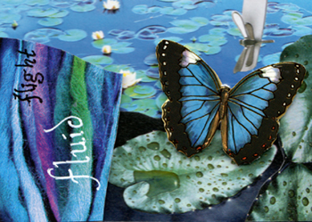
In early March I hosted a one-on-one workshop with Cristiane Doherty (Mixed Media Artist/AOE Communications Specialist). Hoping to make more time for creativity in her busy life, she was glad to secure an evening workshop with me. I was so lucky to have her, too… Cristiane is a multi-talented artist who makes her own collage papers; is an expert in the lettering arts; a graphic designer and former contemporary dancer. I knew I wouldn’t have to push too hard for her to unleash her energy because she came raring to go with a big box of her favourite collaging ephemera. Working with pieces she’d collected over the years, she created her own unique symphony in blue – “Fluid Flight” using the symbols of water, flying insects and the colour blue associated with her astrological sign, Pisces. Here are her reflections about her card: “Inspiration for this ATC came from an honest desire to be surrounded by a pool of creativity. The butterfly represents the energy and the will to take and land where the next project takes me on my journey. Many thanks to Michelle who gave me an opportunity to learn how to put this free form of expression together. I am hooked.” Thanks to YOU, my dear Cristiane! A further thanks for sharing your beautiful hand-made papers with me – along with your ATC, they’re such precious additions to my collections!
 Cristiane Doherty, “Fluid Flight”, ATC, Mixed Media/Collage, 2.5 x 3.5 inches, March 2013… Cristiane brilliantly raised the butterfly and the rectangular layer (left) using double-sided tape to give the piece a cool 3D feel! Under the Forgetting Tree…
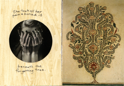
My most current ATC “The Forgetting Tree”, was created for my March monthly trade with Olive Jones’ group. Drawing on personal pain I was experiencing, I selected photo portraits of a woman and a lone floral tree painting; the latter I spotted on an image of some East Indian architecture. I assembled these into a two-paneled book-like ATC which just seemed right to me. Once again, I tried out my Tim Holtz markers, this time using them to create a wood grain-like effect for the interior of my card. In this case coming up with a text for the piece was easy because the minute I saw my images, I instantly knew what the words would be…I love it when that happens. I’m never embarrassed to express and commemorate my pain through my art; it always allows me to lay some of those sad feelings to rest rather than allowing them to consume my life.
 Michelle Casey, “The Forgetting Tree” (Back Cover), ATC, Mixed Media/Collage, 5 x 3.5 inches, March 2013  Michelle Casey, “The Forgetting Tree” (Inside), ATC, Mixed Media/Collage, 5 x 3.5 inches, March 2013… the theme of this card was trees. Easy Make ATCs!
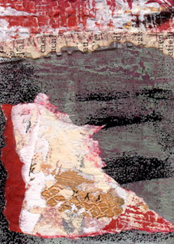
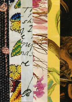
Are you sitting there and saying to yourself, Michelle, I could never make those ATCs like you do! Need to ease your way into making collage ATCs? Here’s a fun idea… just work with texture strips! To make my ATC “Stripes I”, I collected interesting textures from magazines and cut them into thin strips. I glued them side by side and really like their constrasty effects. Although I can be such a stickler for making story-based collages, from time to time I like to go against the grain and make something purely minimal as with my piece “Deeply” or like this very abstract piece… so go ahead and try one out – if you do, I’ll be happy to trade cards with the first person who shares theirs with me! Thanks for taking the time to review my ATC update. Now go forth and make some wonderful ATCs!
 Michelle Casey, “Stripes I”, ATC, Collage, 2.5 x 3.5 inches, January 2013 PLEASE NOTE: I’ll be away on training next weekend. I look forward to connecting with you again on April 14, 2013.
Other Related Links:
Collage Tip #12: How to Make a Collage Artist Trading Card
A Personal Glimpse into the World of Artist Trading Cards
Artist Trading Cards: History, Rituals, How To’s
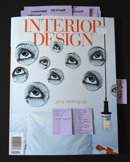
 It’s a good idea to list the things you’ve found on a sticky in the front of the magazine to jog your memory of what’s hidden inside. This week I was going to share some tips about picking characters for your collage stories when I realized I haven’t even discussed selecting a good magazine for collaging with you!
Whether the magazine you buy is gently used or freshly bought, you want to ensure, especially regarding the latter, that your money is well spent. As a seriously obsessed collagist, I spend many hours at magazine stores reviewing publications in every category (fine art, photography, fashion, interior design, etc.) for interesting imagery and text. So I thought I’d give you some suggestions for choosing a magazine…
How Much Should You Spend on a Magazine?
Depending on your lifestyle and/or budget, you can pay as little as a dollar (or less) for some amazing magazines at a local used book stores, thrift shops, flea markets and antique paper shows. Or you can go to a grocery, big box or magazine speciality store and spend any where between $5-$10 for a decent magazine or as much as $15-$20 dollars for thicker exclusive quarterly issue magazines which may be full of cool, blow-me-away collage material! If you are just starting out and/or are especially concerned about making an environmentally-friendly choice, you can make it part of your work/life ethic to buy from thrift stores, used book shops or even trade old magazines with friends for free! I think what is at the heart of choosing a good magazine is that the images resonate with your spirit, life style and values.
How Can You Tell If a Magazine is Good Collage Source?
Because I make collages that tell a story (narrative), finding striking imagery and text are important to me. I think a good magazine should have at least 10-20 images that you feel you can use to build upon (not counting text styles which are easier to find). Sometimes I’m very tempted to buy magazines with only one or two great images, but I never give in (okay maybe once… I’m no saint after all!) – it’s important that I respect my supply budget. When I feel I’m getting carried away on shopping trips, I remind myself that I have a limited amount of studio space for storage… as well, students are always leaving their old magazines for me so I have quite a collection building! It’s far more worth it to choose a magazine that gives much in terms of collage material because it means I have more space on my shelves and in my studio as well as more money in my wallet!
What Type of Imagery to Look for When Choosing a Magazine?
Because I categorize my images at home, I generally have a good idea of what I’m looking for… here’s a list:
1 Interesting characters (of all ages, genders, classes, races, sizes, looks/poses);
2 A variety of textures and patterns;
3 Interesting architecture of building and home interiors;
4 Nature-related imagery;
5 Animals;
6 Objects which could have a story behind them (a pair of shoes, a ring, a stone, etc.);
7 Text/writing in a variety of fonts (including handwriting) and
8 Magazines with different qualities of paper: matte or semi-gloss pages. Note here that glue stick doesn’t adhere well to thick glossy papers. Some magazines are printed on smooth matte newsprint that’s wonderful… here, if you like that nostalgic look, you can go to a used book store or antique fair and buy old magazines with faded or stained pages. Once at an antique fair, I bought a box of old European fashion magazines from the 1950’s for $12 – it was a steal! The images and text were out of this world!
By having criteria for buying and selecting magazines, you can make the most of your collaging. You can also make level-headed spending decisions that ensure your studio space doesn’t get too cluttered. You can choose to make earth-friendly choices that benefit the planet by using recycled magazines. Another thing that’s wonderful about searching for magazines is that it gives you a chance to get out of the studio and socialize whether it’s trading magazines with friends; going to the magazine store or second-hand book shop or antique paper fair. I’ve made friends with a few magazine shop owners who know my taste and love recommending new sources to me. Hours pass by like minutes when I find a magazine I can get lost in. Regardless of the source, for me, finding a good magazine at a reasonable price is like finding gold*! I hope these tips prove useful in your collage projects.
* Note that very cheap magazines with thin pages may not hold up well to collaging… they may tear easily and their cheaper inks may fade or smear. If you use them, I suggest you scan/print or photocopy pages you like on thicker paper so they are more conducive to collaging.
In closing here are some pages from the $7 magazine (pictured above) … it gave back so much … I found over 20 pages of wonderful imagery I could use! Which of these several magazine fragments appeal to you? If you had to take two or three and make a collage story out them, which ones would you choose? What would the theme of your story be? Sometimes I just lay the fragments I have out and see what happens next…
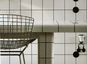
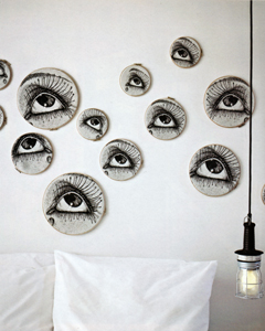
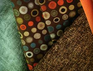
 I find grid patterns so alluring; sometimes I might just use a square or two or three of them. Here I also like the way the texture of the grid mixes with the wire of the chair.  Metal inspired wallpaper – how amazing is that?! If fragmented it could give something a mechanical feel.  I love the visual feel and texture of handwriting on chalkboards.  These eyes attracted me from the moment I saw them… they could be cut out individually or used as a unit – they’re so surreal!  I treasure finds like these beautiful fragments of fabric…  A chandelier with its reflection – so dreamy! Oh, the possibilities...  Depending on your vision, this urban cityscape could be made into a utopic or apocalyptic scenario... Other Related Links:
Collage Tip #7: Going Gaga for Textures
Collage Tip #12: How to Make a Collage Artist Trading Card
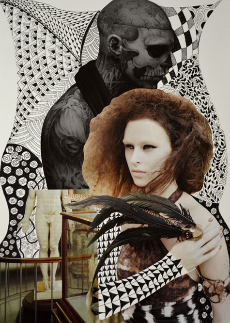
 Michelle Casey, "Death & the Maiden", Zentangle/Collage, 10 x 14 inches, March 2013 Shaking Things Up Creatively…
Every now and again I like to shake things up creatively. In December I made my first collage zine and this month I decided to follow the way of Zentangle! For the past couple of years, I’ve been itching to get back into drawing but never seem to have the time I’d like to devote to courses so I thought perhaps trying my hand at Zentangles might help motivate my creative flow in that direction. A Zen… what, you may ask? Developed by Rick Roberts (a meditation practitioner) and Maria Thomas (a lettering artist), Zentangles are a meditative form of art which draws on the practice of creating repetitive patterning. If exercised carefully it can induce the coveted feeling of being “in the zone”… a place where all we artists want to be!
A Meditative Experience…
I was introduced to Zentangles a few years ago by my friend pencil artist Sheila Cain-Sample. Mesmerized by their fine line and intricate detail, I fell in love with them instantly! Sheila mentioned how much fun they were to make so I vowed to look into making one. A year later, drowning in work, I still hadn’t started my research in this area. Then last fall, as a sign from above, one of my journaling students, Sharon Michaelson, mentioned how much she enjoyed making them, and further, what a wonderful meditative experience it was. Hmmm… meditation, I thought, with my crazy busy life – I sure could use some of that! A couple of weeks later I snapped up Suzanne McNeill’s book: Zentangle Basics. This inexpensive, slim text includes gorgeous images and pattern samples as well as easy-to-read instructions … just flipping through its pages inspired and excited me.
The Never-Ending Benefits of Zentangles…
Last weekend, answering the call of a Facebook friend to post some drawing, I put some time aside to put this new form into practice and found myself enjoying the two peaceful hours I spent composing my first Zentangle! From the get go, I found the results amazing and satisfying… so simple to achieve! Sharon was right; taking the time to draw a Zentangle resulted in a calming, centered feeling within me as well. In fact upon further reading, I discovered their many benefits include: improving focus and concentration; expanding intuition; reducing stress, insomnia and even panic attacks; building self-esteem, dealing with anger management and even team building… a simply astounding array of benefits for everyone! Needless to say making a Zentangle is also a great way to ease yourself back into drawing and expanding your sense of creativity. Thinking back to my early days, I often remember doodling patterns as a prelude to warming up to draw.
Zentangling the Hours Away!
For my first Zentangle, I used a 5 inch x 5 inch piece of smooth, white 140lb mixed media paper. Next, I drew dots on the four inside corners of the paper and connected them so they formed a curvy square shape. Then I drew a curvy line in a kind of “S” shape on the inside of the square which created borders within the square shape; then I chose my favourite sample patterns from McNeill’s book to fill in the various quadrants of my Zentangle; I couldn’t help adding my own adjustments to a couple of her pattern samples. Another thing I liked about creating my Zentangle was that it didn’t require too many supplies… simply a 2B pencil, 05 Black Micron pen, a drawing stump for shading and an eraser. I had a hard time figuring out how to pencil in the finishing shading touches on my piece but Googled a site from Squidoo which gave me some good tips. I still feel I could have been a bit bolder in my shading… oh well, something to practice next time! After I finished my piece, I felt like the end was just the beginning! I was all set to make another one this time perhaps incorporating colour or collage! And, indeed I did! Here’s my Zentangle/collage “Death and the Maiden” (see top of page) – I’m so pleased with my first attempts and have since had thought plenty more about how to improve on them.
More Zentangle Ideas…
I also Googled information on other books on the subject; looked for new more intricate patterns to try as well as checked to see what others were doing with the medium. I initially visualized it as a technique that would be great to integrate into journaling and collage; I was hoping to find others doing this, which I did! I also discovered that text/script looks particularly striking when surrounded by its rhythmic lines and further that natural forms look so rich when filled with its patterning (see links below for examples of these).
I highly recommend creating your own Zentangles. If anyone has already tried them out and would like to share their favourite sample with me, I’d love to see it!
Zentangles: Further Reading:
One Zentangle a Day: A 6-Week Course in Creative Drawing …
Zentangle Untangled: Inspiration and Prompts for Meditative Drawing
Other Related Links:
Cool Zentangle Patterns
Incorporating Zentangle into Journaling
Incorporating Zentangles into Natural Forms
Incorporate Zentangles into Geometric Forms
Basic Zentangle Supplies
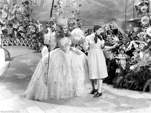
 Glinda the Good Witch of the South and Dorothy on the yellow brick road to the magical land of Oz... Okay, more interview aftermath to discuss with you my dear readers. Some of you may be asking… if you watched or heard the radio excerpt of my interview … why the tears? I have to admit, after I poured out the water works, I felt terribly embarrassed. After weeks of rehearsing answering potentially emotion-filled interview questions with regards to my late father, lost brother and friends of old whom I’ve discussed through my journal pages, I thought for sure I’d be able to hold back the tears and give a professional interview. I even told my friend Wendy Southin and my husband Kevin, who generously gave their time to help me review answers, that there was no way I was crying! In my private life, some of you know what a hyper-sensitive soul I am; it doesn’t take much to get me misty-eyed, but there’s also another side of me that’s (who is that woman? I always ask!) always terribly calm, collected and cool when I need to be. So, now that I think about it, I guess there really was a fifty-fifty chance of me delivering an emotional response whether I wanted to or not! As well as Liana Voia’s question about one of my favourite childhood stories: The Wizard of Oz… one I hadn’t prepared myself for, through me for a loop…
To begin with I was deeply affected by the way Liana conducted the interview… so thoughtfully. I was so impressed that she’d taken much time to acquaint and engage herself with my work. I was also touched by how perceptively she understood what drove the heart of my work and that she respected it. I have worked many years to develop my oeuvre as a visual artist, and when someone I don’t know very well regards my journey, with such great empathy and appreciation, it never fails to surprise me.
When I first learned to “speak” with art as a visual language, there was no question that I wanted to excavate and present my personal history; so much of which was highly emotional and tension-filled. My past, at times was so wretched, I felt I needed to get it out of my system… not with anger or vengeance towards those who had hurt me, but always through some graceful, beautiful means. I knew others had and would be encountering similar issues in their lives so I hoped sharing my pain and point of view might prove cathartic for them as well; through the feedback I get about my art, I feel this is very much the case. And, where was I going with all this? Oh yes, to Oz…
The lack of communication in my childhood home resulted in an adult who whole-heartedly embraced opening up and discussing problematic issues. In this regard, I stuck out like a sore thumb in my family (and still do). Uncovering the world of art and its healing potential was truly my Mecca. Liana’s understanding of the struggles of a young, sensitive immigrant girl who could not turn to her family or friends for help touched a tender spot in my soul. You see this little East Indian immigrant girl found a kindred spirit in the film character of a similar young white girl from Kansas, Dorothy, in L. Frank Baum’s The Wizard of Oz. Just thinking of Dorothy singing “Somewhere over the Rainbow” always chokes me up. Like her, I often dreamed of running away from home to a better place, but a tornado didn’t carry me away, art did. It’s funny but I never knew what the depths of my passion was for this song until I thought about it for split second longer than I usually do when I began to respond to Liana’s question and it sent forth a floodgate of memories, emotions and tears…
What raced through my mind, you must wonder?… well… me, unable to feel at home in Canada or even call India and Pakistan my home… in fact, over a decade ago while researching the history of my parents’ lives in India, I discovered I was born into a race of people who have no geographical territory on the Subcontinent to call home. Some say home is where the heart is; being at home makes you feel like you belong, safe, accepted and loved; maybe that’s why it’s so important to so many of us. Through this long life journey, I’ve discovered that my sense of home will always only truly exist in the world of my imagination and manifest itself through my art. In my Oz world of art, I’ve met my share of tin men, cowardly lions and brainless scarecrows; witches (good, bad and indifferent)… and I’ve even met up with a Wizard as well (he lives in France now). Most importantly, I’ve discovered, like Dorothy and her friends that the things I’ve longed for have always been inside me all along. All I’ve had to do to make them real was/is to have the courage to conjure them into existence… collage them forth from my soul to discover who I really am and to re-create a sense of the world/home through my memories, wishes and dreams.
So all this and more sped through my head and heart as I cried on live public blog talk radio! Afterwards, Kevin, Liana and a number of my friends assured me they didn’t mind me crying at all; in fact, they found it a natural, sincere and touching response. So I guess I really have nothing to be embarrassed about. Thanks again to all of you who’ve sent your thoughts and encouraging words about the interview. I went in with new-found confidence because of your support – it’s been so good to feel the warmth of your kindness.
To Come: Stay tuned for the next weeks topics which will include tips for choosing characters for your collages as well as discussing the fine art of Zentangles!
Other Related Links:
Michelle Casey February 2013 Blog Talk Radio Interview (See last video)
Salman Rushdie: The Wizard of Oz: An Appreciation
Kermit the Frog Singing “The Rainbow Connection”
Neatorama Movie Trivia: The Wizard of Oz
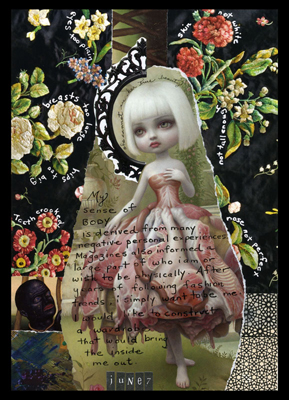
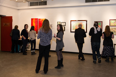
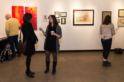
 Michelle Casey, "Body Talk", Collage/Mixed Media, 8.5 x 6 inches, June 7, 2010 on display at the Heartwood Gallery's "Inner Beauty Show", February 2013 This February 2013, I was been pleased to have been part of Hopewell’s “Inner Beauty” exhibition.
When I created my piece “Body Talk” it was with the hope that it would one day be in a space where its theme would inspire others to reflect on the idea of developing a sense of beauty from within. So when Jenn Foote, visual artist and Assistant Coordinator of Hopewell institution, enquired if I wanted to be part of the show at the Heartwood Gallery, I gladly accepted.
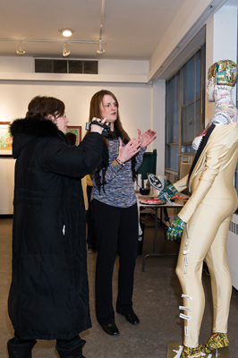
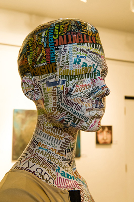
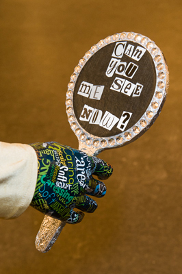
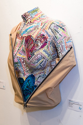
Hopewell, along with the Heartwood Gallery, is located in a modest downtown community centre which services the Ottawa area. Hopewell counsels those dealing with eating disorders. I was surprised to learn from Program Coordinator Lindsey MacIsaac that it services both men and women. For a long time I’ve associated these disorders with women; it was a real eye-opener to discover men too grappled with these issues. Participants in the show ranged from professional artists to others interested in capturing the exhibition’s theme. The show featured an eclectic array of work which included: drawing, painting, photography, mixed media, fibre art and sculpture. A couple of my favourite pieces in the show were collaged-based ones made by Jenn Foote. Drawing on her personal experience with eating disorders, she covered various mannequins’ bodies with inspiring text and words which she created in cool software programs: Wordle and Tagxedo – if you like playing with text, you might want to look into them. A kindred spirit of my piece, Jenn’s pieces powerfully made the case for drawing one’s sense of inner beauty from internal positive reinforcement. It was so cool our works were placed side-by-side in the exhibition… they resonated so much with each other. Being a part of the show gave me the opportunity to meet other wonderful artists; I had great discussions with Cristian S. Aluas and Aimée Britten about their pieces and art careers.
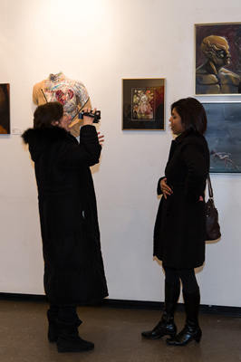
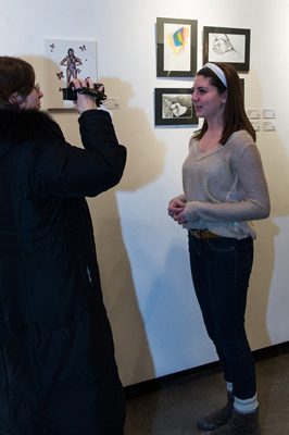
As a bonus, local Ottawa interviewer Liana Voia was also there at the opening to videotape several artists discussing their works. Be sure to check out Contemplative, Expressive and Imaginative Arts for these brief interviews with myself, Jenn Foote, Cristian S. Aluas, Erin Carter and Kaelan Ryan. It was so generous of Liana to cover the show.
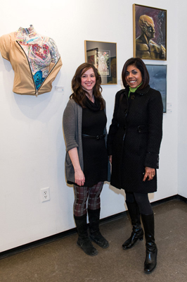
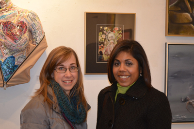
Thanks to all those who made it out to our chilly winter opening in -30 Celsius weather! Artists: Dulce Tapp, Sheree and Monica Bradford-Lea and Alex Johnston, it was so nice of you to come out and offer your support! Dulce, it was so nice meet you in person and hear about your own amazing work! Thanks to Hopewell Coordinators Lindsey MacIsaac and Jenn Foote for doing such a splendid job of organizing the exhibition and opening – it was a joy to work with such a professional team. Thanks also to my hubby Kevin Casey for hauling my work to and from the exhibition, his fine editing skills and role as my back-up opening photographer… and my new makeup artist Angie for making me look so presentable! Last but not least, I’m grateful to my photographer and friend Peter Farris-Manning for providing me with some wonderful photos of the event to share with you… here they are… enjoy!
 Hopewell Program Coordinator Lindsey MacIsaac (left) & Michelle Casey (right), Heartwood Gallery, "Inner Beauty" Opening, February 2013  Alex Johnston (left) & Michelle Casey (right), Heartwood Gallery, "Inner Beauty" Opening, February 2013 (photo by Kevin Casey)  Michelle Casey, Monica & Sherri Bradford-Lea (left to right), Heartwood Gallery, "Inner Beauty" Opening, February 2013 (Photo by Kevin Casey)  Cristian S. Aluas and his wonderful paintings, Heartwood Gallery, "Inner Beauty" Opening, February 2013  Aimée Britten and her triptych, Heartwood Gallery, "Inner Beauty" Opening, February 2013  Mixed Media artist Dulce Tapp (left) & Michelle Casey (right) discussing Dulce's upcoming summer exhibition at Orange Gallery, "Inner Beauty" Opening, February 2013  Artists & visitors enjoying the show, "Inner Beauty" Opening, February 2013  So many came out to view the exhibition on a cold winter's night, "Inner Beauty" Opening, February 2013  Michelle Casey (left) and Coordinator Lindsey MacIsaac chatting about Hopewell's mission, "Inner Beauty" Opening, February 2013  Liana Voia (left) interviewing Michelle Casey (right) about her piece "Body Talk", "Inner Beauty" Opening, February 2013  Liana Voia (left) interviewing Kaelan Ryan (right) about her piece "Butterfly Emerging", "Inner Beauty" Opening, February 2013  Liana Voia (left) & Jenn Foote (right) discussing her piece "Can You See Me Now?", "Inner Beauty" Opening, February 2013  Detail of "Can You See Me Now?" by Jenn Foote, "Inner Beauty" Opening, February 2013  Detail of "Can You See Me Now?" by Jenn Foote, "Inner Beauty" Opening, February 2013  Torso: "Billie - Deconstructed" by Jenn Foote, "Inner Beauty" Opening, February 2013
 My hubby Kevin Casey... first spring in our new home... Many of you have seen how supportive my husband Kevin was at my blog talk radio interview the other week. Now I was thinking some of you might have been surprised to hear Liana Voia, the interviewer, refer to him as a “white male.” We three talked about this after the interview because she was afraid it might have offended him. But no, having a wife in university bandying about these terms for nearly a decade in academic papers, he’s gotten used to it for the most part. Simply put, in academic terms, the privileged “white male” describes a category of person who shares elite privileges in society while many others (ie. disenfranchised women, people of colour, indigenous peoples, etc.) have/do not. While in the world of academia this term is common place, in the real world it may come off as offensive to some. With the passing of time, I’ve come to realize while in the academic world there must be categories to aid discussions, in the real world, there are those from these categories who are always transcending them… like my dear husband…
As a white somewhat middle-class male married to a lower-middle class immigrant woman of colour, for 25 years Kevin has dealt first-hand with the effects immigration and racism have had on my life, career and spirit; he has done everything in his power to help me overcome them. Without his knowledge of Canadian culture, emotional and financial support, I wouldn’t have survived this far or even had the opportunity or courage to study art or start my own business.
 Kevin's Aunts Anne (back) and Georgie Casey at our 1988 wedding... When Kevin and I married decades ago, mixed marriages were not yet in vogue. Many were surprised I married a white Canadian man rather than someone from my Asian background… everyone that is except my grandmother Maria Magdalena. The day Kevin and I got married this petite woman raised a small bony finger to me and said with a mischievous smile: “I always knew you would marry a white boy!” I think it was the longest English sentence she uttered to me in my entire life! Not having gone to university then, I was naturally offended. Granny hadn’t gone to university either; she was simply voicing her own racial prejudices. I wanted to tell her I was marrying Kevin because he shared my values and beliefs; had a spectacular sense of humour; an appreciation for arts and was someone whose kindness and gentle spirit calmed my soul but I didn’t know if she would understand this. You see, for a number of years, my father’s Goan family had hopes I’d marry a boy (preferably a doctor) from their culture to keep my father’s ironically already mixed East Indian-Portuguese (Goan) blood-line pure! My father had disappointed them years before by marrying my mother, an Anglo-Indian (mix of British and Indian), against their wishes. My mom bore the brunt of not being the perfect wife because she came from a culture that was deemed lower than his. It caused so much pain in our lives. Like my father, I resisted this absurd family tradition to follow my heart…
 Salvador Dali's "Crucifixion" (Corpus Hypercubus), Oil on canvas, 1954 Many have wondered too, especially those coming from certain feminist perspectives, why I didn’t keep my family name – I got so much grief for this at university. Well, to be quite honest, I had such unhappy life experiences with my maiden name, I felt becoming a Casey would change my life for the better and it did. I inherited in-laws who warmly welcomed me, particularly the older generation which surprised me – Kevin’s mother Frances and father Charlie made me feel like family from the start. His Aunts Georgie and Anne (on his father’s side) even shared my appreciation for fine art. I remember Georgie, a gentle, soft-spoken woman (a former school teacher) in her late seventies taking a photo postcard of Surrealist Salvador Dali’s “Crucifixion” out of her purse to let me know it was one of her favourite paintings! – revealing a breath-taking open-mindedness I had never encountered in my own family. I viewed this as a good omen; a promising start to my new life as Casey and it proved true. I’ve found my life’s path because Kevin Casey believed in me from the start. He convinced me to go to university to study art when I had given up on my dreams of ever becoming an artist. Since then, my life has been irrevocably transformed thanks to his love and generousity. Thank you my dear Kevin… you’re truly an angel beyond category or classification!
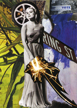
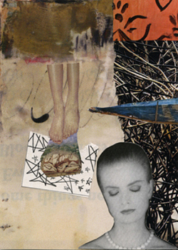
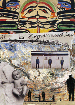
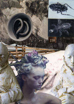
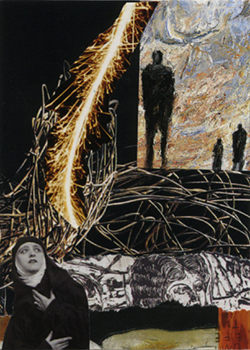
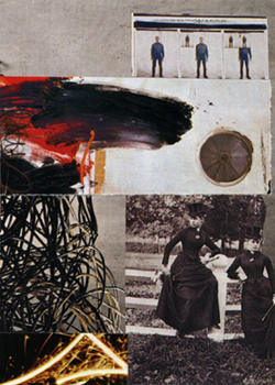
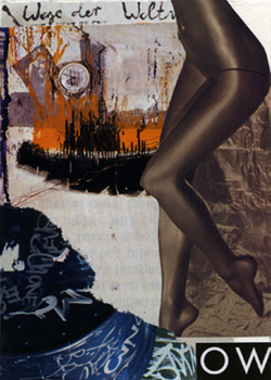
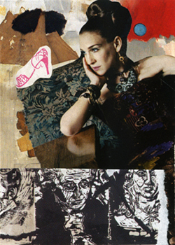
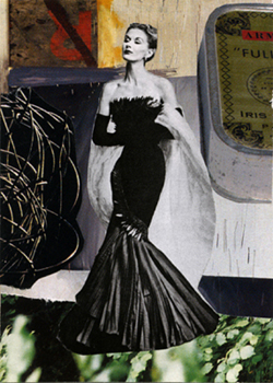
 Michelle Casey, "Untitled 1", Artist Trading Card, Collage, 3.5 x 2.5 inches, 2006 As you can imagine, after preparing for three different events last week, I’m feeling totally and utterly exhausted today! As mentioned last week, I ran across an old Artist Trading Card (ATC) series of mine I hadn’t trade yet. You know how it is sometimes you make things and, for some reason, they’re too hard to part with. So I thought I’d share them with you. The fragments that compose them come from art magazines. I always find art magazines such an inspiring source to draw from because they naturally contain the most arresting visual images of all. In them, artists are breaking and playing with all kinds of visual rules and boundaries; it’s so exciting to use little pieces of their work and transform them into my own zany stories. In working with them, I also learn much about the work of other artists – often I find myself Googling and doing further research on the fragments that strike me the most. It’s such a stimulating process! Anyway, enough blah, blah, blahing from me… you’ll have plenty of that in the weeks to come when I share my blog talk radio experiences with you! In the meantime here’s the series… which I’m quite sure has some sort of biblical streak running through some of it…
 Michelle Casey, "Untitled 2", Artist Trading Card, Collage, 3.5 x 2.5 inches, 2006  Michelle Casey, "Untitled 3", Artist Trading Card, Collage, 3.5 x 2.5 inches, 2006  Michelle Casey, "Untitled 4", Artist Trading Card, Collage, 3.5 x 2.5 inches, 2006  Michelle Casey, "Untitled 5", Artist Trading Card, Collage, 3.5 x 2.5 inches, 2006  Michelle Casey, "Untitled 6", Artist Trading Card, Collage, 3.5 x 2.5 inches, 2006  Michelle Casey, "Untitled 7", Artist Trading Card, Collage, 3.5 x 2.5 inches, 2006  Michelle Casey, "Untitled 8", Artist Trading Card, Collage, 3.5 x 2.5 inches, 2006  Michelle Casey, "Untitled 9", Artist Trading Card, Collage, 3.5 x 2.5 inches, 2006 Note 1 – Zines: I’m mailing out the last batch of zines this week. My apologies to those of you who’ve been waiting so long for them – I had many to send out. You should receive them by the end of February for sure. Thanks to all of you who’ve written me such insightful comments about my little book – I take great pleasure in reading your thoughtful reflections and appreciate the time you’ve spent thinking about my work.
Note 2 – Time Off: I’ll be taking next week off and will be back on February 24, 2013. Have a great couple of weeks!
 Michelle Casey, Untitled Artist Trading Card (1 of 9), Collage, 2.5 x 3.5 inches, 2006 My Blog Talk Radio Interview
Next week I’ll post the link for my February 5, 2013 interview on Contemplative, Expressive & Imaginative Blog Talk Radio for your listening pleasure! I’ve been crazy busy this whole month preparing for it! And, yes, you bet I’m pretty nervous about doing it and really appreciate all the supportive comments many of you have sent me. Jeanne-Sylvie, I promise to concentrate on my breathing! Let’s hope my wordy personality kicks in on cue and I don’t draw too many blanks on live radio!
Silent Auction at the Gordon Harrison Gallery
This event to raise money for the Canadian Hunger Foundation (CHF) came out of the blue early last week when a former student and friend, Ruby, asked me to donate something for the institution which is close to her heart. So I’m submitting a limited edition print of my collage: “Princess in the Making” to the CHF which is holding a wine and cheese silent art auction event at the Gordon Harrison Gallery in Ottawa on February 7, 2013. For more information on this, see my Exhibitions Page. For more information on the story behind the making of the collage and my obsession with royalty, please see the links below.
Heartwood Gallery “Inner Beauty” Show
The “Inner Beauty” group show I’m participating in was installed and ready for public viewing on Friday. The Opening will take place on February 7, 2013 from 5pm to 7pm; the show will be on for the whole month of February 2013 at the Heartwood Gallery. In case you don’t know, the event has been organized by the Hopewell institution which counsels women dealing with eating disorders. I feel so honoured to be part of a show in which I can contribute my work: “Body Talk” that deals with this very theme. It’s so great when our work as artists can also be a part of the public dialogue to help others in our community. A portion of the proceeds from the show will go to Hopewell. Thanks to all of you who’ve supported the upcoming exhibition on Facebook –I really appreciate it! Thanks too to Program Coordinator Lindsey MacIsaac and her assistant Jenn Foote for their help in organizing the event. Please see my Exhibitions Page for more information.
Workshops Dates Are Up!
Dates for my Vision Board and Visual Journaling workshops are up! I’m happy to introduce my new workshop: “Defying the Blank Journal Page!” this April 2013. Please see my Workshops Page for further information.
Next Week: ATC Surprise!
This week while I was tidying up my studio, I found a set of ATC cards I hadn’t exchanged yet! I love this series so much I decided to hang on to it a little while longer. I used the same process to create them as I described in my how-to blog of last week. Here’s a sneak peek at one of them (see top). Next Sunday, I’ll post the whole series!
Have a great week!
Other Related Links:
Stuck on the Royals
Stuck on the Royals Part II
How to Make a Collage ATC
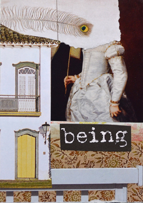
 Michelle Casey, "Being", Collage, Artist Trading Card, 2013 Today I thought I’d share some tips on creating a collage Artist Trading Card (ATC) with you. Rather then working with a theme, sometimes I like to throw caution to the wind by letting my ATC create itself (so to speak). Here’s some insight into the process using my latest ATC creation (shown above): “Being”…
 Step 1: Select Images for your Artrist Trading Card Selecting Images…
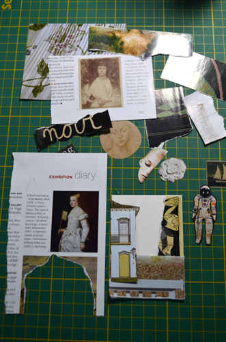
With “Being” I set a simple goal of creating an ATC with a more or less monochromatic colour palette with a couple of pops of colour. I began by selecting 25 small images* and text from leftover magazine scraps. While selecting images, I noticed the ones with creamy/white and gold tones appealed to me so I grouped them together; this narrowed my images down to about 15 pieces.
 Step 2: Arrange different combinations of images on your Artist Trading Card Arranging Images…
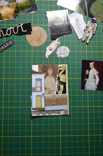
Next, I randomly selected images and arranged them on my card in different positions to see how they worked together. At this stage I like to play with the visual elements of my collage. I like to suggest a story so I pick a character and create a setting for them to inhabit; something that will reveal their history or personality. In the photo above, you’ll notice six potential characters for my story: three different women, an astronaut, a half torso and even a sailing ship. Of these I decided I liked the image of the torso, two of the women and the astronaut. I worked with these continually re-arranging them with settings and objects until I arrived at a composition I liked.
 Step 3: Compose your collage with the pieces that feel "right" to you... also use the strategies described below to help you When Composing…
I use these tactics (quite unconsciously) in my collaging; it’s good to be aware of them when you don’t know what to do or when you’re stuck.
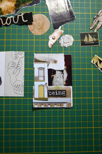
1 Ensure contrasting colours: dark and light work well together… as they draw the eye in and out of the picture plane. For example, in my ATC, note how the blackness behind the girl becomes a room the viewer’s eye can enter while the light feather background, house façade and wall paper become architectural elements that tease us by enclosing and shielding parts of her from view. Dark and light colours also give the image a dramatic, theatrical edge.
2 Use compositional lines effectively so that they encourage viewers to explore the entire surface area of your collage. In “Being” see how the feather on the top-left corner draws the viewer to the girl on the right side whose hand points to the word “Being” which hovers over the white banister which connects to the house on the left side whose pointed roof draws us back up to the feather – thus giving us a whole tour of the card!
3 Use interesting textural elements in your collage to engage viewers. In my ATC, these are found in the satiny shadows of the girl’s dress; the patterned floral wallpaper; the intricate design on the white door and the detailed mysterious peacock feather which conceals her face adding further intrigue.
4 Make use of repetition in your collage by repeating similar: colours, lines and shapes. In “Being” you’ll notice the yellow door at the bottom of the card echoes the yellow of the peacock feather above it; that the lines of the feather echo the lines of the white banister along the bottom of the card. Using this strategy helps to unify the collage.
Finding the Right Text…
Text is the final layer I add after I’ve had a chance to fully contemplate the meaning of my collage. I’m not sure why, but from the start, I was drawn to the word “Being”. When choosing words, keep in mind their: shape, font-type, colour, clarity (heaviness, crispness, lightness) and size contribute to their visual character as well as the possibility of adding further emotional and psychological depth to your piece. Here I loved the ghostly ephemeral feel of the old-fashioned typewriter Courier style font used for “Being” … it’s as though it might disappear at any moment! Had it been typed in bold, in another colour or in another font, I don’t think I would have felt it belonged in my collage and I’d have searched for another word. Adding text, however, is optional – so do what you feel is in keeping with the mood you want to create… for some, the images speak for themselves.
 Final Step: Before gluing your pieces down remember it's never too late to try other image combinations to ensure you do indeed have the right pieces! Final Thoughts…
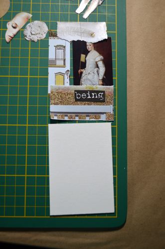
At the pre-gluing stage, remember it’s never too late to try out other fragment combinations before you finally cut and glue your material down. Ask yourself if everything works together as a cohesive unit… here wait a few hours or a day or even ask for someone’s opinion on your collage.
Remember too, collaging is part of your fantasy world, so anything goes… any images whether they’re from the same time period/era, will look like they’re connected once you thoughtfully cut or tear them and glue them onto your card… everything has the potential to belong if you create the right conditions for it. This happens when you are “listening” or becoming in tune with the pieces you select.
* Note: It can be quite challenging to find images that fit the ATC card size: 2.5 x 3.5 inches. I search for fairly small images or tear fragments from larger images as well as get most of my images from the back sections of interior decorating, art and fashion magazines where they have mini photos of products, artworks and people, respectively.
Trade an ATC with Me!
Thanks for taking the time to review the process – I’d love to know if it works for you. As a bonus, I’ll be happy to trade cards with the first person who comments on this blog post!
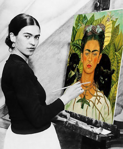
 Frida Kahlo painting a stunning self-portrait “I recommend her to you, not as a husband but as an enthusiastic admirer of her work, acid and tender, hard as steel and delicate and fine as a butterfly’s wing, lovable as a beautiful smile, and as profound and cruel as the bitterness of life.” (Diego Rivera of Frida Kahlo)
Last Saturday I visited the Art Gallery of Ontario’s Frida & Diego exhibition: “Passion, Politics & Painting” in Toronto and finally had a chance to see the work of one of my favourite artists: Frida Kahlo!
I first glimpsed Kahlo’s work years ago in a modern art history class. I was so taken by several of her self-portraits, I wrote a paper on one. I loved the way she incorporated personal history, cultural mythology/iconography and haunting dream-like imagery into her paintings. Although she’s often compared to the Surrealists who painted dream-like worlds, Kahlo maintained she painted her reality. I was spellbound by the many painful self-portraits of the artist; her unhappiness exposed like an open wound for all to see* – her sadness over her husband Diego’s numerous affairs; the many miscarriages she suffered and the pain she endured from many operations due to chronic pain caused by a near-fatal accident in her youth. Far from being a bed-ridden soul, Kahlo led a tumultuous existence, one in which she carried out scandalous love affairs with both men and women and as a rebel rouser for the Marxist political cause in Mexico. Despite personal hardships, Kahlo used art to lift herself out of her misery and carved out prolific career for herself.
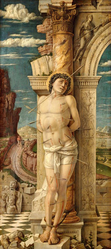
 Painting of Saint Sebastian by Early Renaissance artist Andrea Mantegna, c. 1455 When I think of Frida Kahlo’s work, I’m reminded of the Roman Catholic saints I read about as a child. In these books, the saints appeared as tragic heroic figures often portrayed alongside the very weapons their enemies used to kill or torture them with: swords, fire, and arrows… in these haunting representations they stood angelic or defiant with eyes raised upward to heaven or downward in humility. I secretly longed to become one of them! Instead, decades later, I would find Frida K., their anti-thesis, and she would become my patron saint of art. Rather than offering up her life up to God, she fought for life and her own personal causes: art, politics and her beloved husband, also a renowned painter.
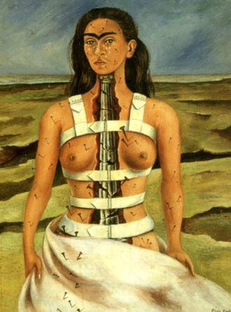
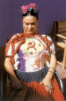
 “The Broken Column” painting by Frida Kahlo, 1944 It was incredible to see the original work “The Broken Column” I’d written about years ago. Here Kahlo depicts herself in a Christ/martyr-like manner. She stands in a desolate landscape, her body flayed open to reveal a broken architectural column which replaces her spine. Nails pierce her body and the tiniest of tears trickle down her face. A tortured soul, she boldly confronts the viewer as if to say “all this… and still I go on!” Among other things, the painting reflects the agony inflicted upon her body by many surgeries – 32 over her life span which left her unable to carry a child to full term. There are a number of images depicting Kahlo in the hospital after suffering a miscarriage; she doesn’t shrink from making reference to this incident in drawings or paintings rendering bodily organs, precious fetus and blood in the finest detail and jewel-like colour. A piece I never expected to see in the exhibit was one of the plaster corsets Kahlo wore to help support her body. On this one she had painted the Communist sickle and hammer symbol across the chest and a fetus on the belly. Seeing it in person struck an emotional chord in me. A kind of spiritual armor, this relic is evidence that even in the lowest physical and emotional state, expressing herself was vital. I draw such strength from her contradictory visual mix of vulnerability and power. To see the many versions of Frida persevering life’s various misfortunes one beautiful painting after the next, ignites my admiration for her and makes me wonder if perhaps art and the creative life can save us from the madness life doles out.
 Photo of Frida wearing the body cast she painted depicting hammer, sickle and embryo. Seeing the works of my artist idols never fails to make me reflect upon my own strategies as an artist. Kahlo’s work made me realize that it’s okay to express my personal pain, even publicly through my art. I think of her courage and audacity in depicting paintings of her fetus at the time when such subject matter was taboo. She was painting and confronting issues which would have never been mentioned in polite society during her day! … such an event a woman or a couple would have endured in silence, in privacy of their own home… if they even acknowledged it at all. I realize not everyone can relate to work like this. But for those of you who do, I hope you’ll draw on the same sense of strength I draw from Kahlo’s work. While some put their most idealistic faces forward for the artist portrait, Frida Kahlo simultaneously reveals life’s breathtaking beauty and ugliness … she stands with her painter’s “brush of anguish”** in hand refusing to sweep the emotional debris of life under the carpet… and I love her for that!
Regardless of whether the work is happy, sad or somewhere in between, finding kindred artists can help situate where we’d like our work to go as budding or emerging artists and creatives. Who is/are your role model(s)? Whose work stirs your soul? I would love to know… I hope someone will share theirs with me!
* Note 1: Kahlo didn’t just focus on the pain in her life; there are many other paintings that reveal her other moods and interests. She was known to have a great sense of humour as well.
** Note 2: The term “brush of anguish” is taken from the title of Martha Zamora’s book about Frida Kahlo which I highly recommend.
Other Related Links:
Frida Kahlo Fans Website
|
|
